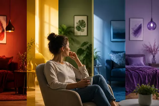
Walk into a fast-food restaurant and a hospital waiting room on the same afternoon, and your body reacts to each before you consciously notice why. One buzzes with red and yellow energy, the other soothes with soft blues and greens, and in both cases the colours are working on you long before you order a burger or sit down to wait.
Colour is one of the most powerful and least noticed forces shaping how we feel. Your brain reads it in a fraction of a second and adjusts your mood accordingly, often without a flicker of awareness on your part. Marketers have known this for decades, and a striking share of our snap judgements about a product or a room are driven by colour alone, formed before we have consciously assessed anything else. The clearest way to see how it works is to split the spectrum in two.
Almost every effect colour has on mood begins with one basic divide, the split between warm and cool tones. The two families pull your nervous system in opposite directions, and simply knowing which is which explains a great deal about how different rooms make you feel.
What it does
Warm colours
Cool colours
Examples
Red, orange, yellow
Blue, green, purple
Effect on the body
Raises heart rate and arousal
Lowers heart rate and blood pressure
How it feels
Energising and social
Calming and focused
Best suited to
Lively, sociable spaces
Restful, productive spaces
These are not just poetic associations but measurable bodily responses, showing up in heart rate, blood pressure and stress hormones, and often taking hold within minutes of walking into a space. Warm hues rev you up while cool hues wind you down, which is the single most reliable rule in the whole of colour psychology.
Once you notice this, you start to see it deployed everywhere, and screens are no exception. The palette of any interface you open, from a banking app to the page you reach at a slotozen, has been chosen deliberately to set a certain mood before you have read a single word. Colour is quietly doing a job on you in the background, whether you are in a room or looking at a screen.
The reason colour can move us at all is that it is not purely psychological, but partly wired into the body. Some of what a colour does happens in the mind through learned association, yet a surprising amount is plain physiology, ticking away regardless of what we believe.
A red room genuinely raises arousal and physical readiness, nudging up the heart rate as if the body were preparing for action. A blue room does the reverse, measurably lowering blood pressure and calming the nervous system, which is exactly why so many hospitals now lean on cool palettes to settle anxious patients. Even more concretely, blue light suppresses the sleep hormone melatonin while red light barely touches it, one reason screens late at night keep us awake and warmer lighting helps us drift off.
Green sits in a category of its own here, thanks to a well-studied idea called attention restoration theory. The thinking is that green, natural settings give the tired brain a chance to recover from mental fatigue, and studies of people walking green routes rather than grey urban ones find them not only less stressed but noticeably more energetic afterwards. Remarkably, a slice of that benefit seems to survive indoors, so even a few houseplants or a view of a park can lend a room a quietly restorative feel.
Zoom in from the broad families and each individual colour carries its own particular flavour of influence. The headline associations are consistent enough to be genuinely useful, provided you hold them loosely rather than as iron rules.
The most studied colours break down roughly like this:
Used with a light touch, these tendencies are a designer’s toolkit for steering how a space feels. It always pays to recall, though, that the exact shade does much of the work: a soft sage green soothes where a harsh lime jars, and a deep navy reassures where an electric blue energises. The trouble only begins when people mistake these handy rules of thumb for hard scientific laws, which is where colour psychology tends to overreach.
For all its real power, colour psychology is also one of the most oversold ideas around, wrapped in myths that do not survive close inspection. The truth is messier, more personal and a good deal more interesting than the tidy charts suggest.
The psychologist Andrew Elliot has shown that a colour’s effect depends heavily on the situation in which you meet it, an idea he calls colour-in-context theory. The very same red that sharpens attraction on a date can spike anxiety on an exam paper, and the red that means stop on a traffic light means celebration at a wedding. On top of that, the exact shade, brightness and neighbouring colours often matter more than the basic hue, so a muted dusty blue whispers calm professionalism while a bright saturated one feels sporty and loud. Much of what people accept as fixed colour meaning is really learned from culture and personal history, which is why grander claims, such as a special shade of pink taming aggression, have quietly collapsed under proper testing.
None of this stops industries from putting colour to work with great deliberation, since even a modest, reliable nudge is worth a fortune at scale. Once you know the basic rules, the reasoning behind everyday design choices becomes almost comically obvious.
Restaurants drench themselves in warm reds and yellows to raise energy and stir the appetite, then wonder why nobody lingers, while hospitals choose cool, muted tones to ease anxiety and help patients feel safe. Offices and classrooms increasingly avoid busy, overstimulating schemes that fray concentration, and clever designers restrict the most intense warm colours to a small share of a room, often only a tenth or a fifth of the visible surfaces, so a space feels lively without becoming exhausting. The colours around you, in short, are rarely an accident.
It is worth adding one honest caveat to all this cleverness. Our reactions tend to fade with familiarity, so the bold accent wall that felt exciting on day one quietly becomes wallpaper within a fortnight as the brain habituates. Individual wiring matters too, and someone especially sensitive to stimulation may read a warm, busy room as agitating rather than energising, which is why no single palette works for everyone.
The colours around you shape your mood through a genuine mix of biology and association, with warm tones lifting your energy and cool tones settling you down, all playing out quietly beneath your notice. It is a real effect, measurable in the body, even if the pop-psychology version wildly overstates how rigid and universal those rules are.
The useful takeaway is not to memorise a chart of colour meanings, but simply to notice the palette you surround yourself with and ask whether it suits the mood you actually want. A calmer bedroom, a more energising workspace, a friendlier front room may be only a coat of paint away.
Yes, though modestly. Warm colours like red raise heart rate and arousal, while cool colours like blue lower them and calm the nervous system. These are measurable bodily changes, not just subjective impressions.
Blue is the most reliably calming, measurably lowering heart rate and blood pressure. Green runs it close, carrying restorative, natural associations that help a tired mind recover, which is why both suit restful spaces.
Because red grabs attention and stimulates appetite and urgency. Warm reds and yellows raise energy and encourage quicker eating, which is why fast-food brands in particular rely on them so heavily.
No. They are tendencies, not laws. A colour’s effect shifts with culture, personal history, shade and context, so the same colour can feel calming in one setting and agitating in another.


Players must be 21 years of age or older or reach the minimum age for gambling in their respective state and located in jurisdictions where online gambling is legal. Please play responsibly. Bet with your head, not over it. If you or someone you know has a gambling problem, and wants help, call or visit: (a) the Council on Compulsive Gambling of New Jersey at 1-800-Gambler or www.800gambler.org; or (b) Gamblers Anonymous at 855-2-CALL-GA or www.gamblersanonymous.org.